Thursday, 23 April 2015
Monday, 13 April 2015
Friday, 27 March 2015
Evaluation Question 4
I
also had a fair amount of problems with the technologies I used, such as when
it came to complete my mock exam, my footage would not transfer onto the iMac
due to incompatibility. This meant that I could not produce the mock to the
best of my ability and hindered the whole process of creating my product. I
therefore, had to re-film all of my footage over the Christmas term. This meant
that I would have to change my idea due to weather conditions and other
external influences on the production of my music video and ancillary texts.
This also meant that I had to use more of my actors time to film the footage.
This also came as a shock to me, because I was not familiar with creating a
moving image product anyway. However I spoke to my teacher about it, who said
that it would be alright if I were to film the footage again and work my
hardest to get the product finished on time.
When
using the camera and tripod, I also had trouble getting the angle that I wanted
from the positioning of my camera and tripod. However I overcame this problem
by moving my actor to the anticipated position and then setting up the camera
once he was in position. I had a lot of footage which I couldn’t use due to bad
angles and framing, however, I managed to have enough good footage to create
the video in the end. The weather became a problem for me after having to
re-film the majority of my footage, because it was getting dark really early on
the night, and I didn’t get home until it was really dark, this forced me to
change my idea of setting and meant that filming indoors was the best option
for me. Whilst I was not particularly keen on this idea to begin with, I believe
it added a sense of innocence to my video, suited the lyrics and also because
the song is not well-known it added to the unknowing nature of the video and
looked like a new entry to the music industry.
I also had to download my song from YouTube because it is
not on iTunes which caused me problems because I had to spend time downloading
it at home and bringing it on my memory stick, so to begin with I was trying to
edit the video without a song in the background. I feel that I dealt with the
problems that I had effectively in order to create my product and also the
ancillary texts. I had a lot to catch up on because of these difficulties,
however, I managed to finish the video to a standard that I am happy with, and
maintain the continuity I wanted throughout my product and ancillary texts.
Evaluation Question 3
My audience feedback has allowed me to make necessary changes to my products from both my first year and my second year by giving me ideas and inspiration to ensure that my target audience would enjoy and actively receive my products.
I feel that it is very important to engage with your audience before and after the product is created to ensure that they would like it and actively receive it. I completed this survey on Survey Monkey and sent it to friends and left it on the public website for about a week to receive some ideas that would help me to create my product in the best interest of the target audience which I had chosen.
Evaluation Question 2
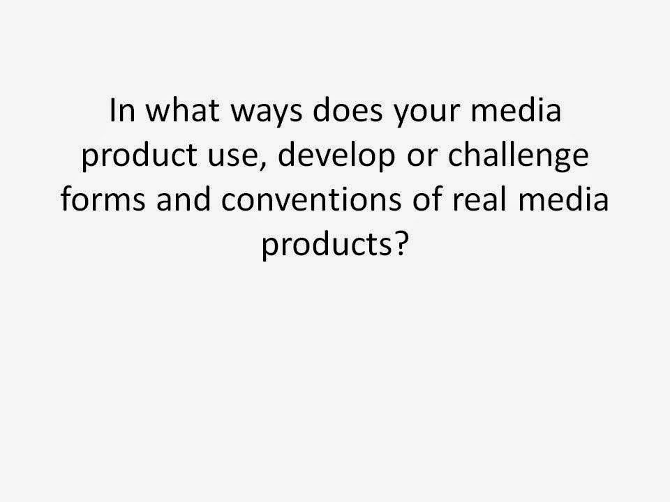
I decided to keep my poster relatively simple because it is easier for audiences to read quickly and be enticed to, rather than something that is too full with information and a lot of writing. I also kept it black and white to re-enforce the house style and to emphasis the simplicity that I was trying to achieve. The use of the iTunes logo on my poster also adapts to modern day music, as streaming and online downloading are increasingly popular with audiences globally therefore presenting them with a new product that includes web 2.0 that they are familiar with.
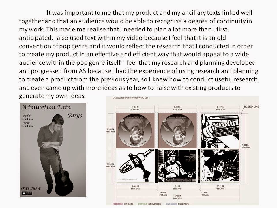
My digi-pak on the other hand involves filters to almost animate my actor on the front and back covers, sticking to the black and white theme, I have made it appealing to audiences by again keeping it simple rather than too full of information. I have also given a lot of focus to the guitar and the microphone in order to emphasise the talent that artists have in today's society and to also reflect the reality of this song, because it has not been auto-tuned, it was performed on Britain's Got Talent, I feel that this is what makes my artist different to many who are in the music industry today, because many rely too heavily on editing techniques rather than their own talent, which is not a true reflection of music, and takes away a lot of emotion and meaning. I feel that my digipak breaks stereotypical conventions, which gives it a unique selling point and also distinguishes my artist from others.
I enjoyed creating continuity because of the simple fact that it was up to me what my decisions were, and I could create my own meaning in my own products without having an official video existent that I could possibly refer to and take ideas from, it was all down to my own creativity. I feel that the combination of my music video and my ancillary texts is effective because of the reasons I have stated, and I also feel that it means that audiences will be more accepting of my product and will be able to recognise the continuity throughout my products.
Thursday, 19 March 2015
Front and Back Covers
 This is the front cover of my digipak, the black and white theme is apparent throughout my promotional package in order to create continuity. I have put the title vertically down the right side of the cover which is a somewhat popular convention of the pop genre, also the picture has been edited using the 'sharpen' filter on Photoshop, using the 'stamp' effect.
This is the back cover of my digipak which also follows the same continuity having used the same filters on Photoshop. I have used Lucida Calligraphy font to make it look 'fancy'. This is also a feature that I have used throughout to maintain the continuity.
Draft Digipak
Tuesday, 10 February 2015
Monday, 9 February 2015
Final Cut
I have been experimenting with different styles in Final Cut Pro, so that the editing merged well and that it looked professional. I like this style because it ages the footage and goes well with my song choice.
I also like this style because it resembles an old television with the scratches which again, ages my footage but also merges with the camera angle well.
I have used different instruments in the video to resemble the music behind the song that I am using. There is a short time during the song when the drums are significant which is why I have filmed this because the drums are dominant and it fits well.
Tuesday, 6 January 2015
Monday, 5 January 2015
Subscribe to:
Comments (Atom)


